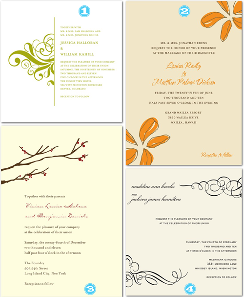
Next up in trying to help Christen design her October 2010 wedding are the invitations. The invites are CRUCIAL, as they are the first glimpse your guests will get at the fabulousness that is your big day! (What’s funny is that all of us Tipsy gals, individually, gravitated to Wedding Paper Divas for our picks. All the invites you see can be customized to ANY color scheme that Christen wants!)
- Sarah-I love this invite because it’s simple with a touch of modern romance!
- Der-I like this invite because I happen to have found out that orange is Christen’s favorite color this week! I also like that this is simple and elegant, but unusual. No one has orange flowers on their wedding invitations…even more reason for Christen to DO IT!!!
- Court-I picked this invite because its got some traditional components, it has a classic feeling but has a modern touch with the blooming trees across the top. I think the Autumn orange fits perfectly with her colors/flowers/theme and the price of the invitations is more on the conservative side.
- AK-I like this invite for two reasons…you can incorporate the chocolate color into the invite and I think it is sorta fancy schmancy without being too stuffy. I absolutely love having the names be a cursive and the rest not. Like, love love!
Tipsy readers…tell us which one is your favorite!


Recent Comments